) Communication > Writing > Fonts
Letterings page : Antiqua / Latin alphabet / Typeface / Typography / Handwriting - Penmanship - Manuscrit / Calligraphy / Blackletter / Glyph / Font (computer, monospaced) /
Typography
│
│
├── Structure of the page : Canons of page construction / Column / Margin / Page numbering / Pull quote / Recto and verso / Blank page
├── Paragraph : Alignment / Leading / Line Lenght / River / Runaround / Widows and orphans
├── Character
│ ├─ Typeface anatomy : Counter / Diacritic / Dingbat / Glyph / Ink trap / Ligature / Rotation / Subscript ans superscript / Swash / Text figures / Dot
│ ├─ Case distinction : Initial / Title case or headline / Letter case / All caps / Small caps / Camel case / Snake case
│ ├─ Visual distinction : Blackboard bold / Bold / Color printing / Italics / Oblique / Underline / Whitespace
│ ├─ Horizontal aspects : Figure space / Kerning / Letter spacing / Pitch / Sentence spacing / Thin space / Word spacing
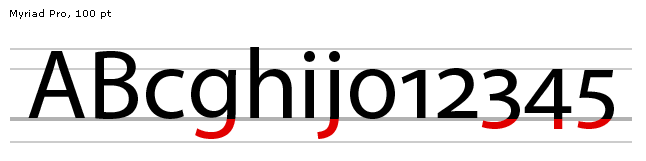
│ ├─ Vertical spects : Ascender / Baseline / Body height / Cap Height / Descender / Mean line / Overshoot / x-height
├── Typeface classifications
│ ├─ Roman type
│ │ ├─ Serif : Antiqua, Didone, slab serif : RockWell, Courier
│ │ └─ Sans-serif
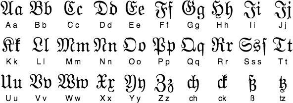
│ ├─ Blackletter type
│ │ ├─ Fraktur
│ │ ├─ Rotunda
│ │ └─ Schwabacher
│ └─ Gaelic Type
│ ├─ Insular / Enluminures
│ └─ Uncial
├─── Handwriting script
│ ├─ Ancient and medieval : Visigothic / Rustic / Carolingian / Beneventan / Bastarda or Hybride / Early Cyrilic / Glagolitic / Lombardic / Court hand
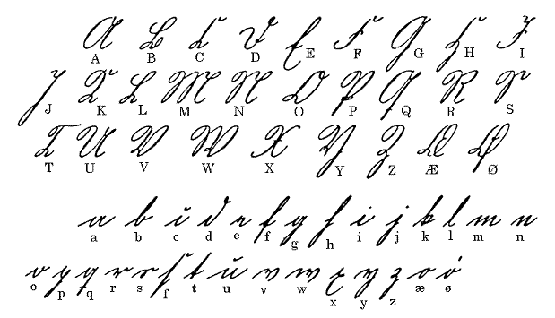
│ ├─ Modern : Cursive / Chancery / Johannine / Humanist / Secretary / Library / Copperplate / Spencerian / Ronde / Kurrent / Russian Cursive / Skoropis / Short hand or stenography / Asemic
bopomofo (ㄅㄆㄇㄈ) https://fr.wikipedia.org/wiki/Bopomofo
https://upload.wikimedia.org/wikipedia/commons/7/7f/Bopomofo.png
Typography : The word derives from the Greek roots : týpos 'type' and graphía 'writing'. Typography is the art and technique of printing font and making it legible, readabble and appealing when displayed.
Counter : In typography anatomy, a counter is the area of a letter that is entirely or partially enclosed by a letter form or a symbol (the counter-space/the hole of). An aperture is the opening between an open counter and the outside of the letter.
Diacritic : Accent, mark, sign, or glyph added to a letter or to a basic letter.
Dingbat : Printer's ornament (can be unicode character)
Ink trap : is a feature of certain typefaces designed for printing in small sizes.
Subscript and superscript : character that is set slightly below or above the normal line of type, respectively. It is usually smaller than the rest of the text. ² is a superscript.
Swash : Typographical flourish, such as an exaggerated serif, terminal, tail, entry stroke, etc., on a glyph
All caps : (or caps lock) text in capital letters without any lowercase letters.
Small caps : character typeset that are capital letters but reduced in height and weight close to surrounding lowercase and text figures.
Camel case : Uppercase in the middle of a phrase. Practice of writing phrases starting with either case then following words having an initial uppercase letter. (ex : CamelCase)
Snake case : sometimes stylized autologically as snake_case) is the naming convention in which each space is replaced with an underscore (_) character, and words are written in lowercase. It is a commonly used naming convention in computing. (Space character is preferably replaced by an underscore because the space character in encoded as %20 )
Blackboard bold : style of writing bold symbols on a blackboard by doubling certain strokes
Kerning : process of adjusting the spacing between characters in a proportional font.
Pitch : Pitch is the number of (monospaced) letters, numbers and spaces in one inch (25.4 mm) of running text, that is, characters per inch (abbreviated cpi), measured horizontally. The pitch was most often used as a measurement of the size of typewriter fonts as well as those of impact printers used with computers.
Typeface : is a design of letters, numbers and other symbols, to be used in printing.
Font-Family : is a design of letters, numbers and other symbols, to be used for electronic display
Typeface Family : A typeface family is typically a group of related typefaces which vary only in weight, orientation, width, etc., but not design. For example, Times is a typeface family, whereas Times Roman, Times Italic and Times Bold are individual typefaces making up the Times family.
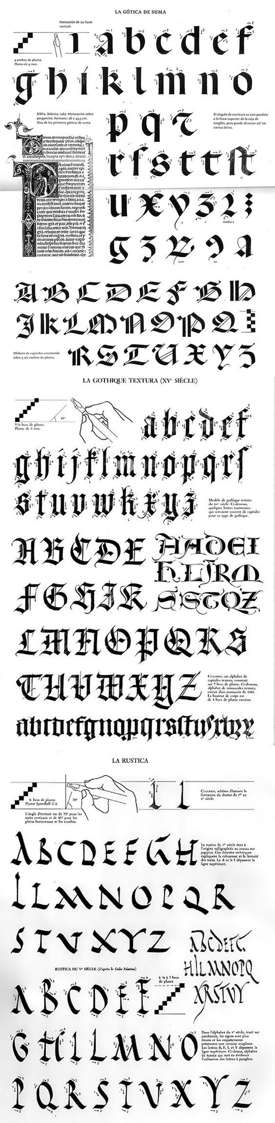
Blackletter, also known as Gothic script, Gothic minuscule or Gothic type, was a script used throughout Western Europe
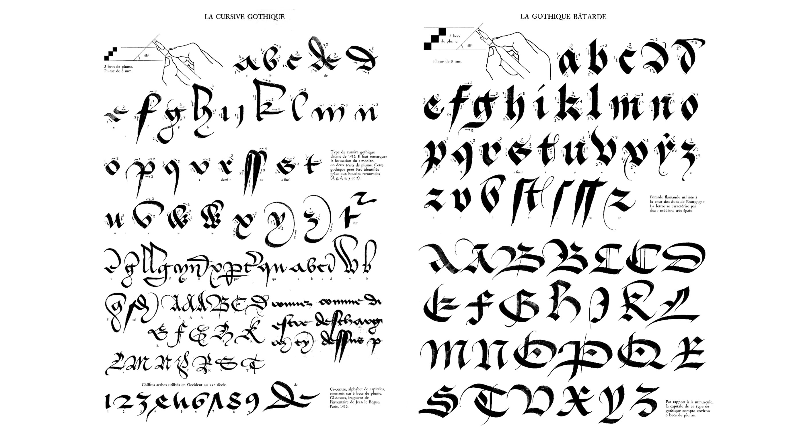
Cursiva refers to a very large variety of forms of blackletter; as with modern cursive writing, there is no real standard form. It developed in the 14th century as a simplified form of textualis, with influence from the form of textualis as used for writing charters. Cursiva developed partly because of the introduction of paper, which was smoother than parchment. It was therefore, easier to write quickly on paper in a cursive script.
Asemic : asemic writing is a wordless open semantic form of writing.
In graphemics and typography, the term allograph is used of a glyph that is a design variant of a letter or other grapheme, such as a letter, a number, an ideograph, a punctuation mark or other typographic symbol
Communication > Writing > Fonts
Letterings page : Antiqua / Latin alphabet / Typeface / Typography / Handwriting - Penmanship - Manuscrit / Calligraphy / Blackletter / Glyph / Font (computer, monospaced) /
Typography
│
│
├── Structure of the page : Canons of page construction / Column / Margin / Page numbering / Pull quote / Recto and verso / Blank page
├── Paragraph : Alignment / Leading / Line Lenght / River / Runaround / Widows and orphans
├── Character
│ ├─ Typeface anatomy : Counter / Diacritic / Dingbat / Glyph / Ink trap / Ligature / Rotation / Subscript ans superscript / Swash / Text figures / Dot
│ ├─ Case distinction : Initial / Title case or headline / Letter case / All caps / Small caps / Camel case / Snake case
│ ├─ Visual distinction : Blackboard bold / Bold / Color printing / Italics / Oblique / Underline / Whitespace
│ ├─ Horizontal aspects : Figure space / Kerning / Letter spacing / Pitch / Sentence spacing / Thin space / Word spacing
│ ├─ Vertical spects : Ascender / Baseline / Body height / Cap Height / Descender / Mean line / Overshoot / x-height
├── Typeface classifications
│ ├─ Roman type
│ │ ├─ Serif : Antiqua, Didone, slab serif : RockWell, Courier
│ │ └─ Sans-serif
│ ├─ Blackletter type
│ │ ├─ Fraktur
│ │ ├─ Rotunda
│ │ └─ Schwabacher
│ └─ Gaelic Type
│ ├─ Insular / Enluminures
│ └─ Uncial
├─── Handwriting script
│ ├─ Ancient and medieval : Visigothic / Rustic / Carolingian / Beneventan / Bastarda or Hybride / Early Cyrilic / Glagolitic / Lombardic / Court hand
│ ├─ Modern : Cursive / Chancery / Johannine / Humanist / Secretary / Library / Copperplate / Spencerian / Ronde / Kurrent / Russian Cursive / Skoropis / Short hand or stenography / Asemic
bopomofo (ㄅㄆㄇㄈ) https://fr.wikipedia.org/wiki/Bopomofo
https://upload.wikimedia.org/wikipedia/commons/7/7f/Bopomofo.png
Typography : The word derives from the Greek roots : týpos 'type' and graphía 'writing'. Typography is the art and technique of printing font and making it legible, readabble and appealing when displayed.
Counter : In typography anatomy, a counter is the area of a letter that is entirely or partially enclosed by a letter form or a symbol (the counter-space/the hole of). An aperture is the opening between an open counter and the outside of the letter.
Diacritic : Accent, mark, sign, or glyph added to a letter or to a basic letter.
Dingbat : Printer's ornament (can be unicode character)
Ink trap : is a feature of certain typefaces designed for printing in small sizes.
Subscript and superscript : character that is set slightly below or above the normal line of type, respectively. It is usually smaller than the rest of the text. ² is a superscript.
Swash : Typographical flourish, such as an exaggerated serif, terminal, tail, entry stroke, etc., on a glyph
All caps : (or caps lock) text in capital letters without any lowercase letters.
Small caps : character typeset that are capital letters but reduced in height and weight close to surrounding lowercase and text figures.
Camel case : Uppercase in the middle of a phrase. Practice of writing phrases starting with either case then following words having an initial uppercase letter. (ex : CamelCase)
Snake case : sometimes stylized autologically as snake_case) is the naming convention in which each space is replaced with an underscore (_) character, and words are written in lowercase. It is a commonly used naming convention in computing. (Space character is preferably replaced by an underscore because the space character in encoded as %20 )
Blackboard bold : style of writing bold symbols on a blackboard by doubling certain strokes
Kerning : process of adjusting the spacing between characters in a proportional font.
Pitch : Pitch is the number of (monospaced) letters, numbers and spaces in one inch (25.4 mm) of running text, that is, characters per inch (abbreviated cpi), measured horizontally. The pitch was most often used as a measurement of the size of typewriter fonts as well as those of impact printers used with computers.
Typeface : is a design of letters, numbers and other symbols, to be used in printing.
Font-Family : is a design of letters, numbers and other symbols, to be used for electronic display
Typeface Family : A typeface family is typically a group of related typefaces which vary only in weight, orientation, width, etc., but not design. For example, Times is a typeface family, whereas Times Roman, Times Italic and Times Bold are individual typefaces making up the Times family.
Blackletter, also known as Gothic script, Gothic minuscule or Gothic type, was a script used throughout Western Europe
Cursiva refers to a very large variety of forms of blackletter; as with modern cursive writing, there is no real standard form. It developed in the 14th century as a simplified form of textualis, with influence from the form of textualis as used for writing charters. Cursiva developed partly because of the introduction of paper, which was smoother than parchment. It was therefore, easier to write quickly on paper in a cursive script.
Asemic : asemic writing is a wordless open semantic form of writing.
In graphemics and typography, the term allograph is used of a glyph that is a design variant of a letter or other grapheme, such as a letter, a number, an ideograph, a punctuation mark or other typographic symbol
 ^ Capital letters in 1) regular 2) italic 3) swash style.
 ^ A set of sixteenth-century initial capitals

 ^ Blackboard bold : mainly using in mathematics, blackboard bold is style of writing bold symbols on a blackboard by doubling certain strokes.
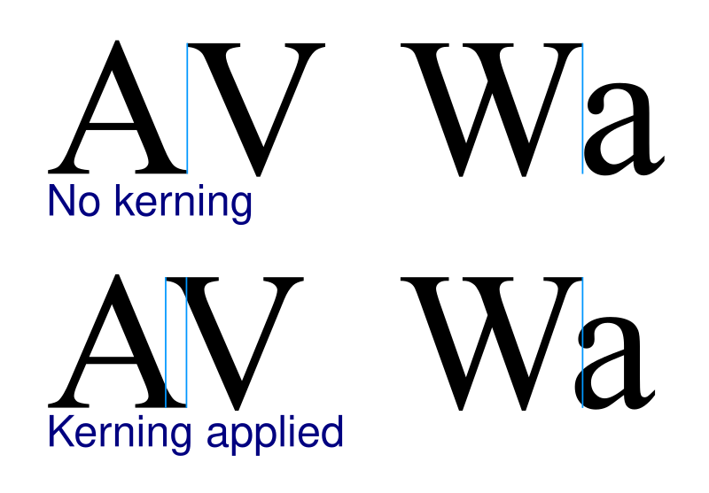 ^ Kerning / Crénage
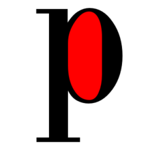 ^ Counter : Counter-space is the area of a letter that is entirely or partially enclosed by a letter form or a symbol. There are closed counters (A,B,D,O,P,Q,R) ad open counters (C,F,H,S). The digits (0,4,6,8,9) also have counters.
 ^ Overshoot
 ^ Dingbat : Printer's ornament.
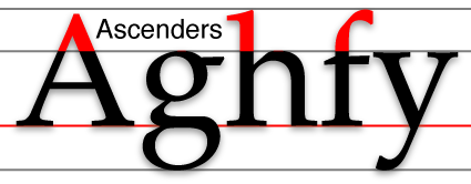 ^ Ascenders / Descenders v
 ^ Baseline.
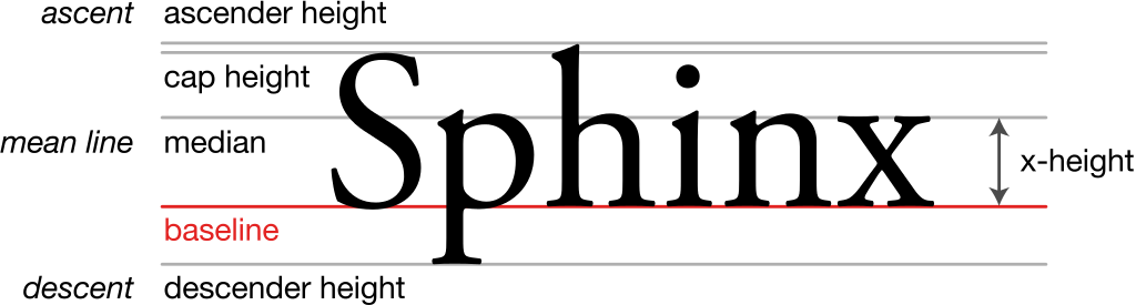 ^ Typography height

 ^ Proportional and Monospace difference
 ^ Anatomy of a Devangari font.
 ^ "A Specimen", a broadsheet with examples of typefaces and fonts available. (1728)

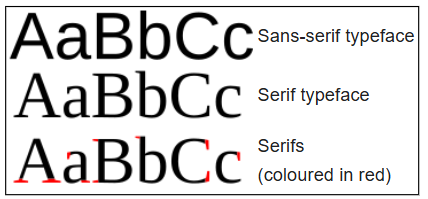 ^ Serif, Sans-serif

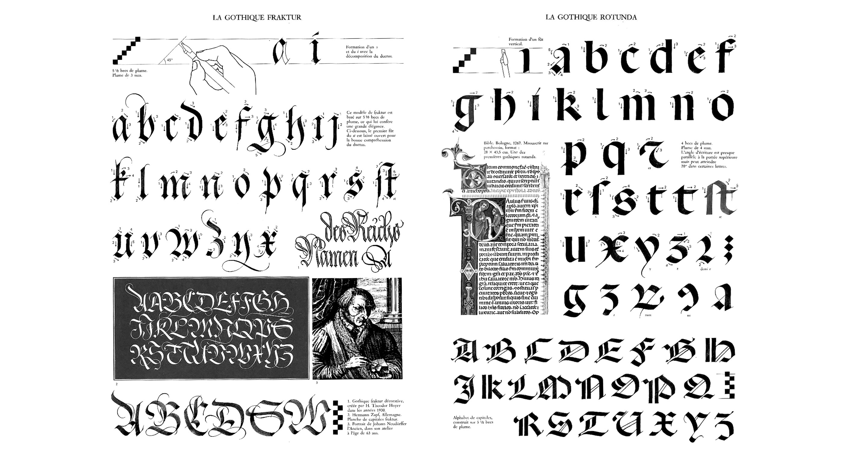
Fraktur is often characterized as "the German typeface", the word "Fraktur" derives from Latin frāctūra ("a break"), built from frāctus, passive participle of frangere ("to break"), which is also the root for the English word "fracture".
Rotunda : The Rotunda is a specific medieval blackletter script. It originates in Carolingian minuscule. Sometimes, it is not considered a blackletter script, but a script on its own. It was used mainly in southern Europe.
Schwabacher : specific style of blackletter typefaces which evolved from Gothic Textualis (Textura) under the influence of Humanist type design in Italy during the 15th century. Schwabacher typesetting was the most common typeface in Germany, until it was replaced by Fraktur from the mid 16th century onwards. In the course of the 18th and 19th centuries (but in Germany not until 1941), Fraktur gave way in turn to Antiqua.
 ^ Gaelic typefaces.
 ^ Visigothic.
 ^ Lombardic.
 ^ Glagolotic script
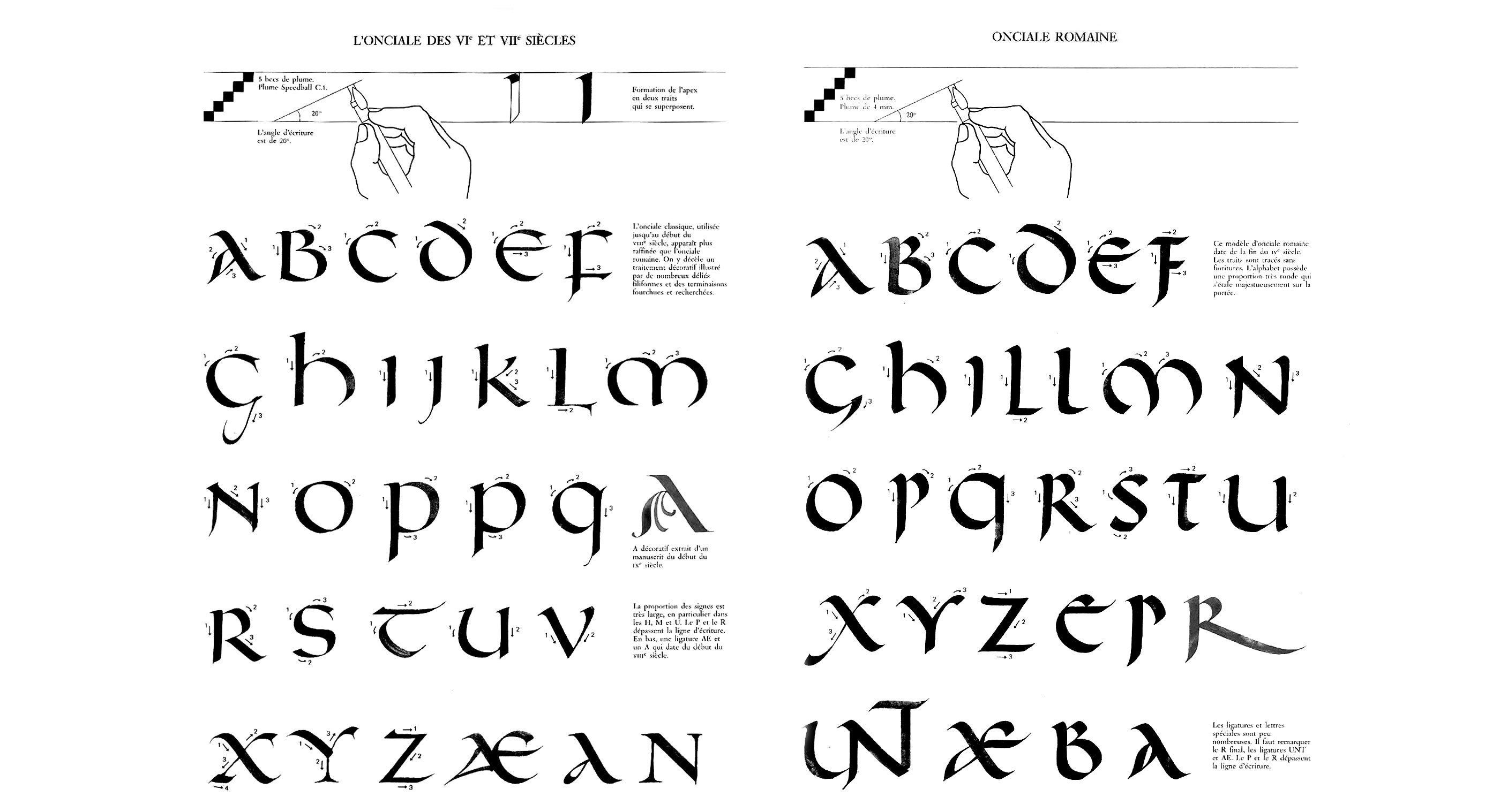
 ^ Uncial / Onciale.
 ^ Fraktur.
 ^ Old English.
 ^ Rotunda.
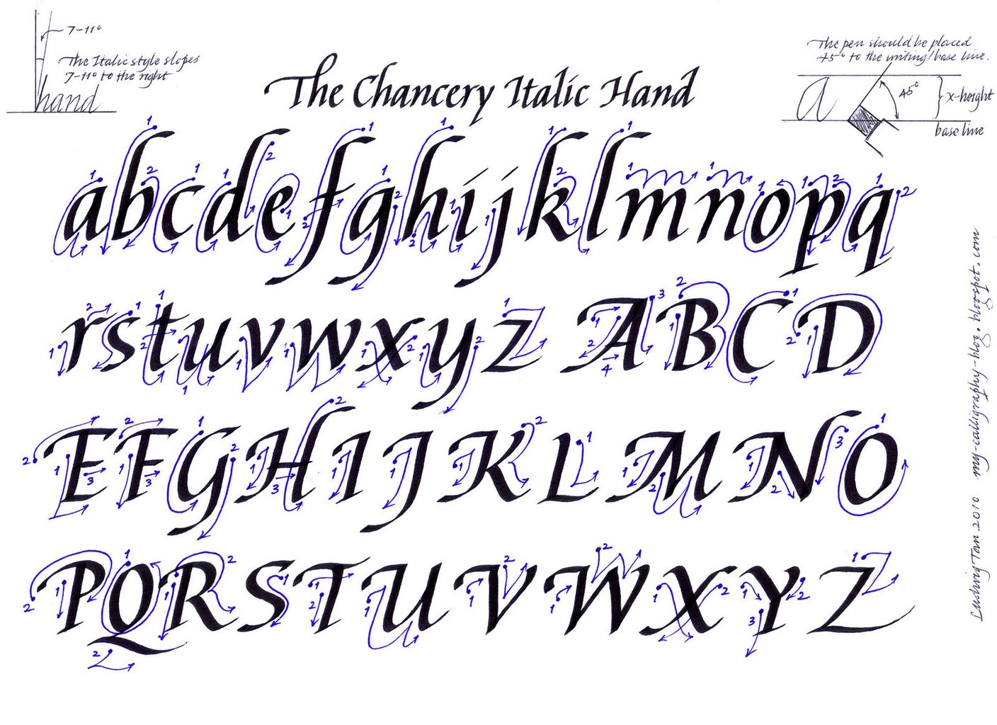
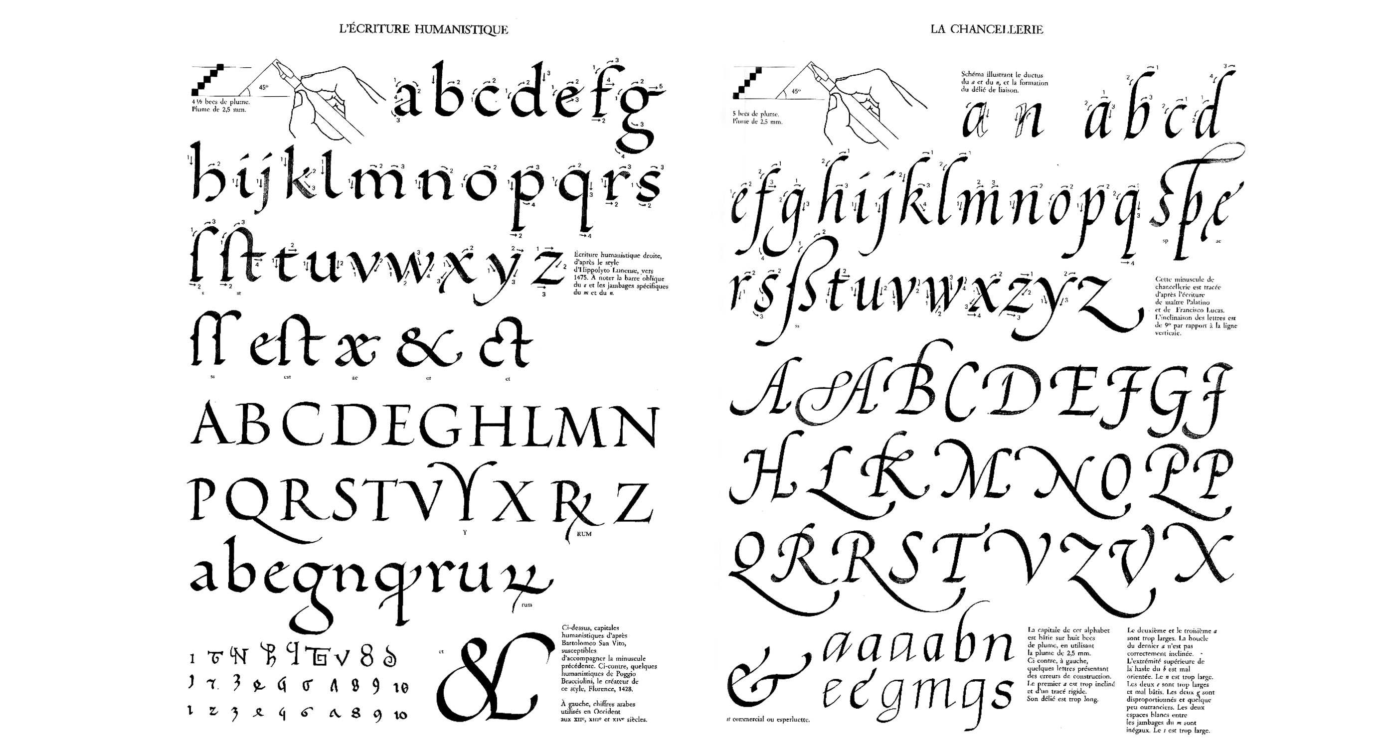
 ^ Chancery.
 ^ Secretary.
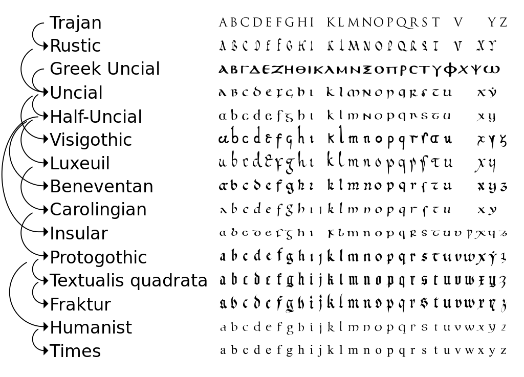 ^ Simplified relationship between various scripts, showing the development of Insular uncial from Roman and the Greek uncial.
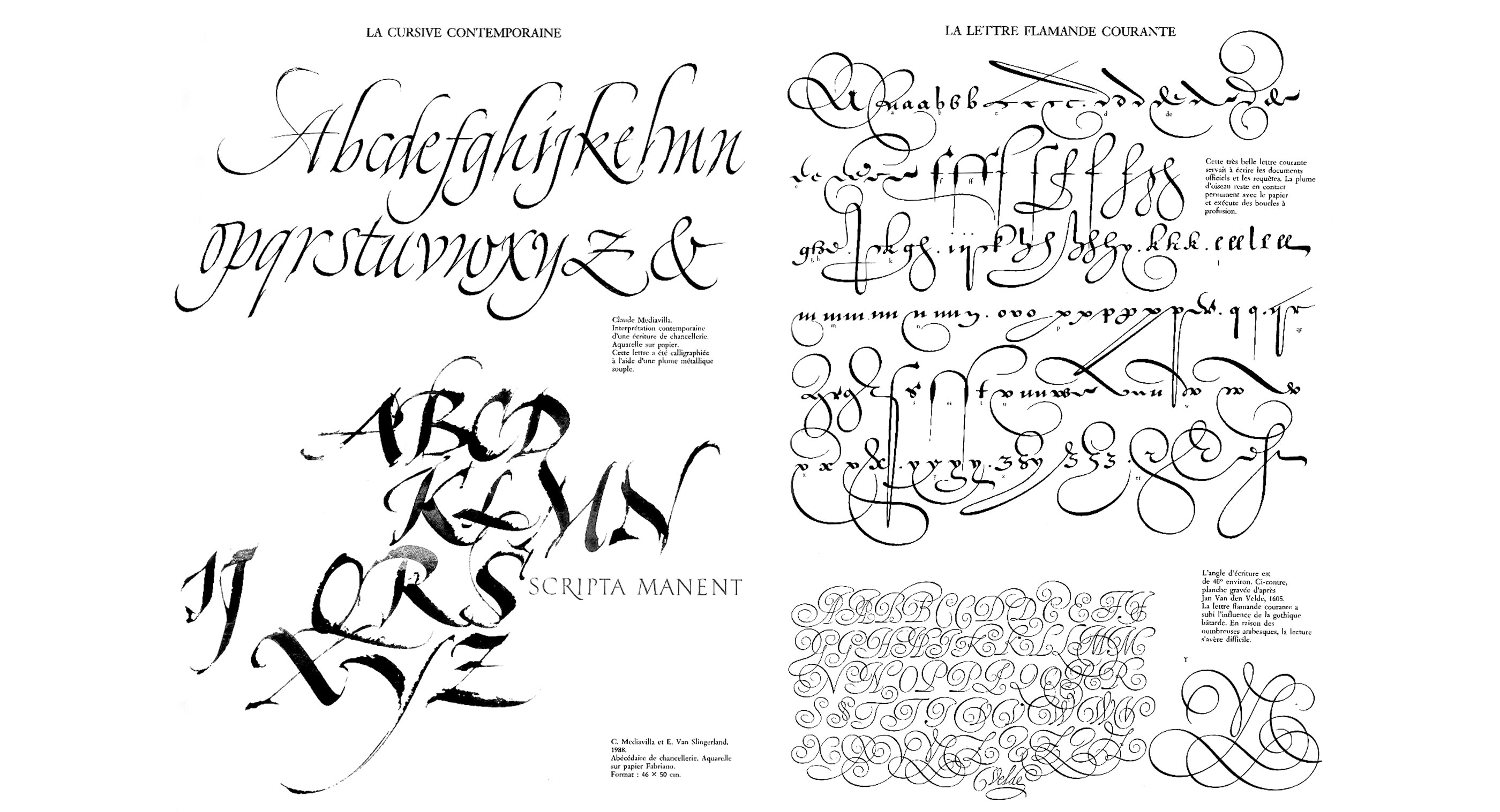
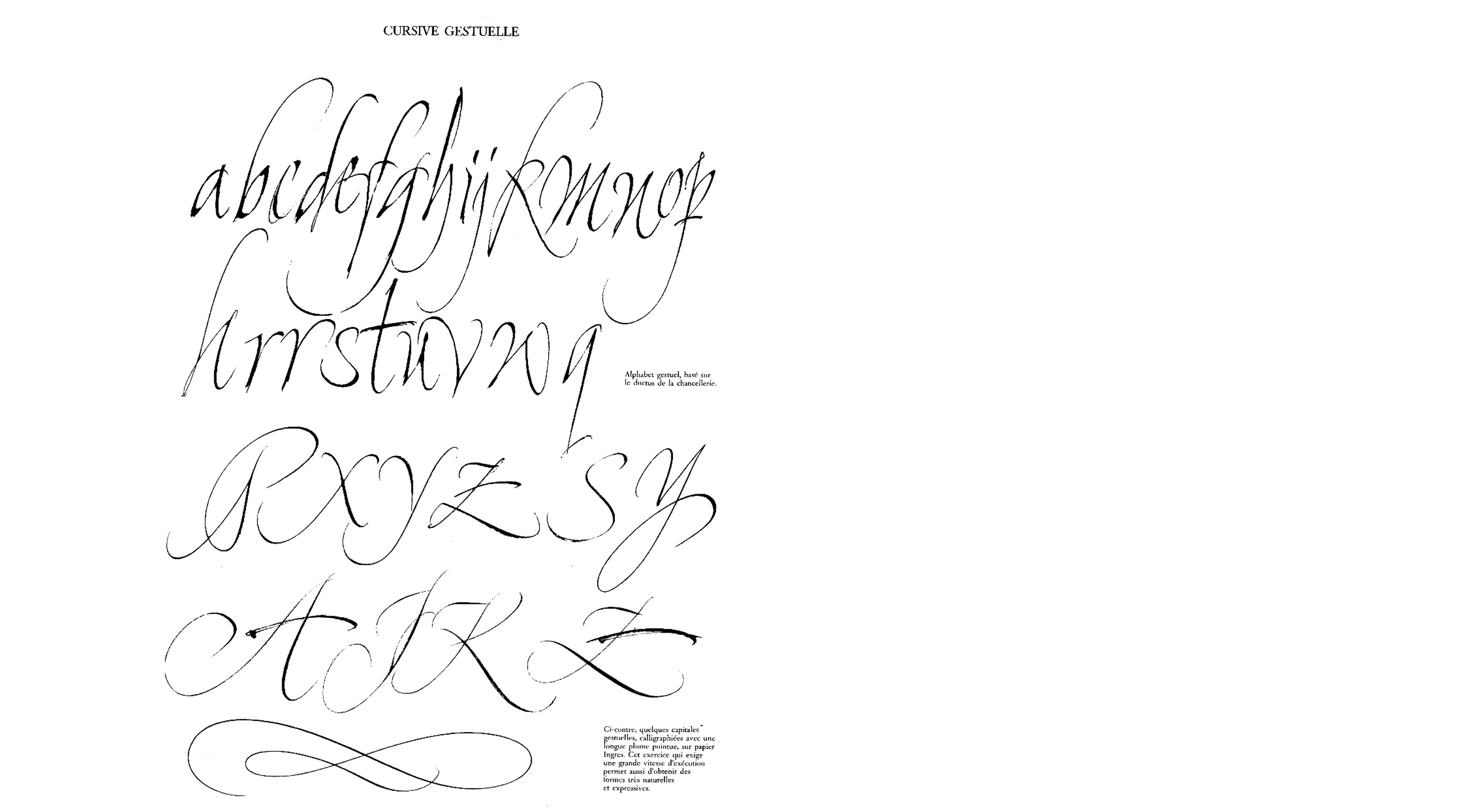
 ^ Claude Mediavilla studies.
 ^ Bastarda / Hybride.

 ^ Kurrent
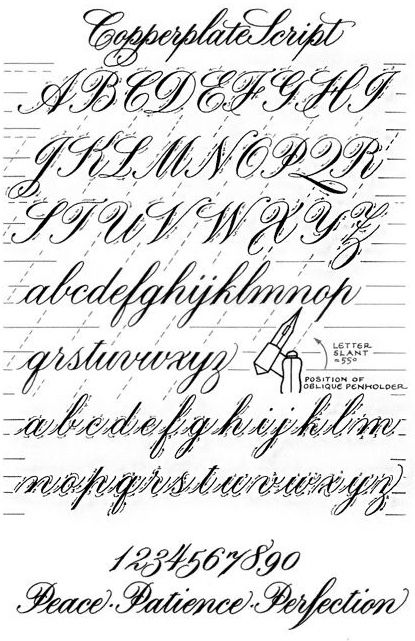
 ^ Copperplate
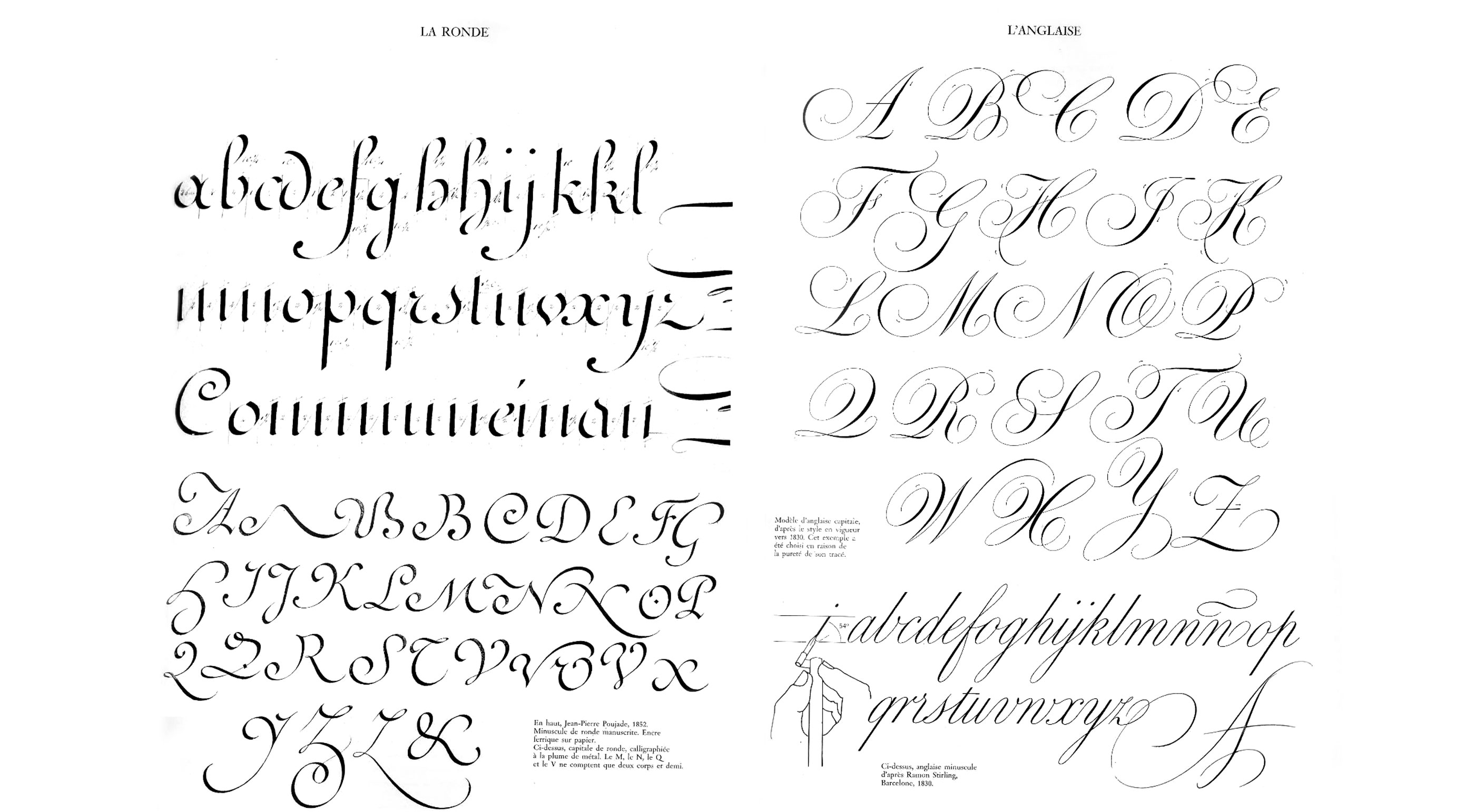
 ^ Ronde
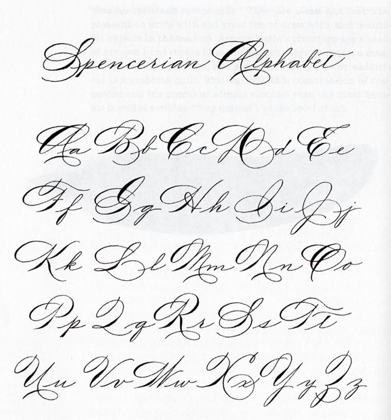 ^ Spencerian.
 ^ Clligraphic cursive from 1835.
 ^ Court Hand : Court hand (also common law hand, Anglicana, cursiva antiquior, and charter hand) was a style of handwriting used in medieval English law courts, and later by professionals such as lawyers and clerks.
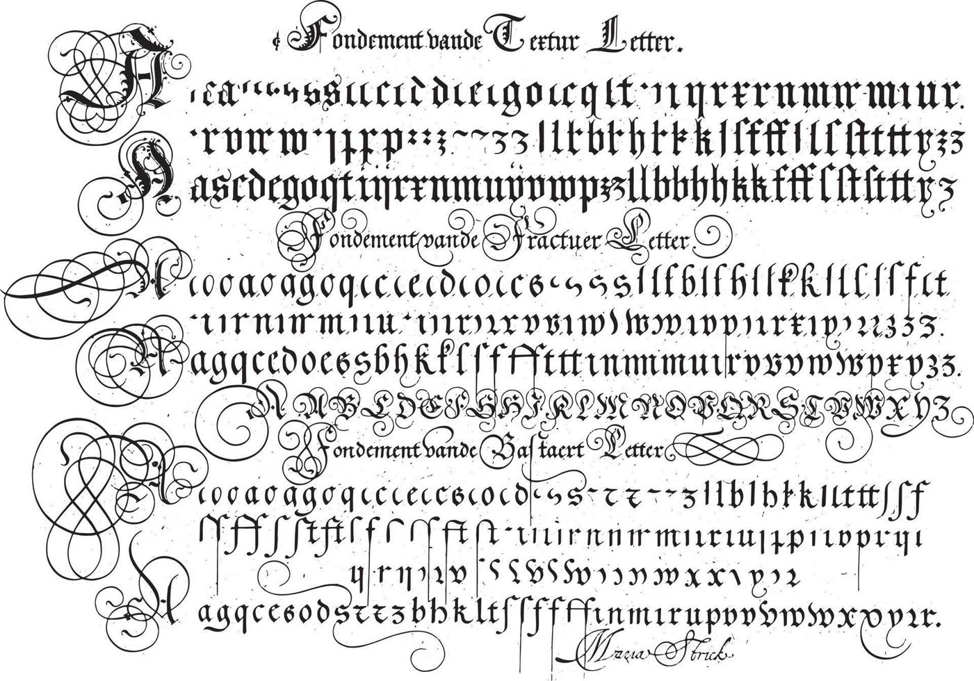
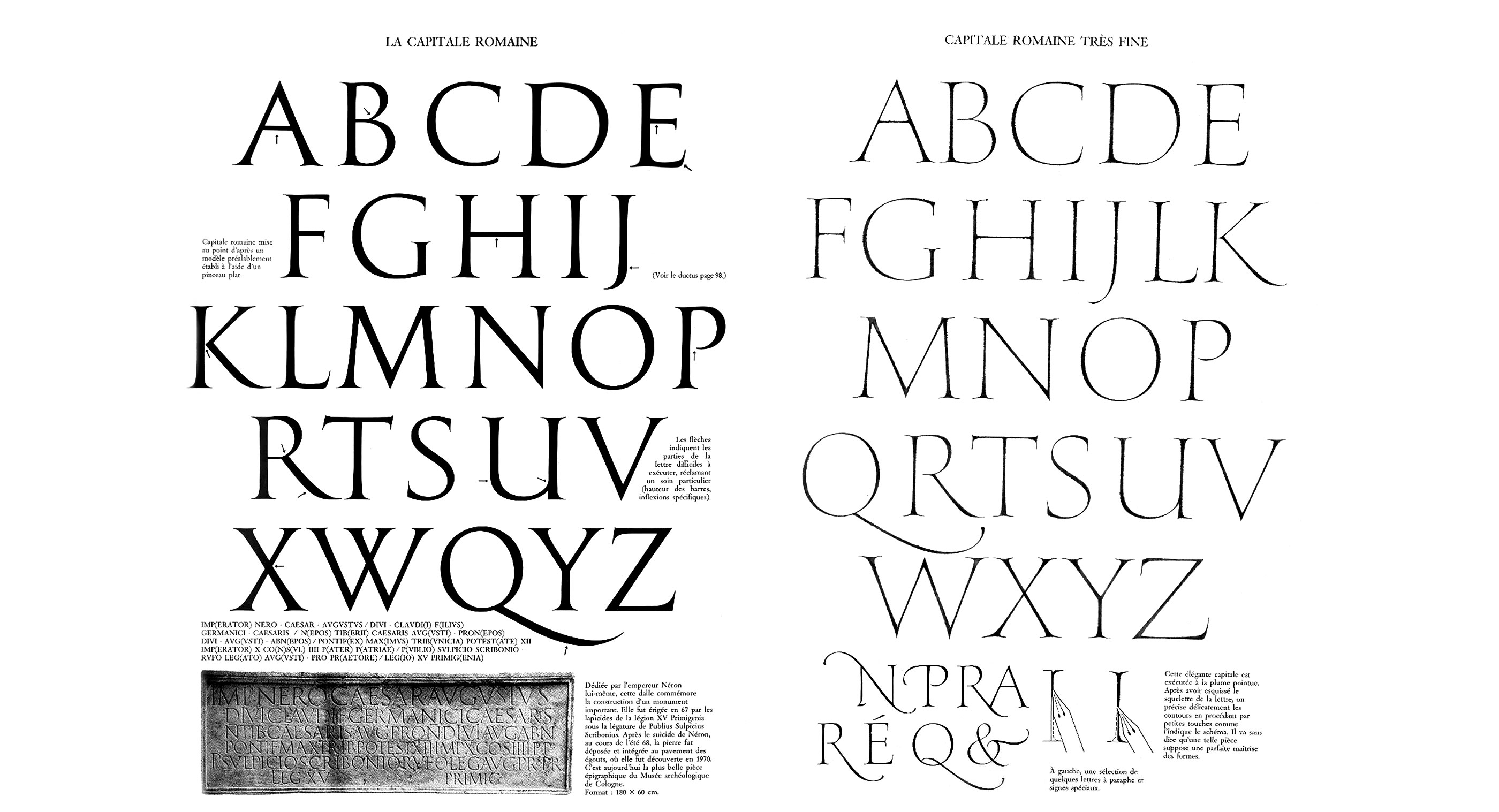
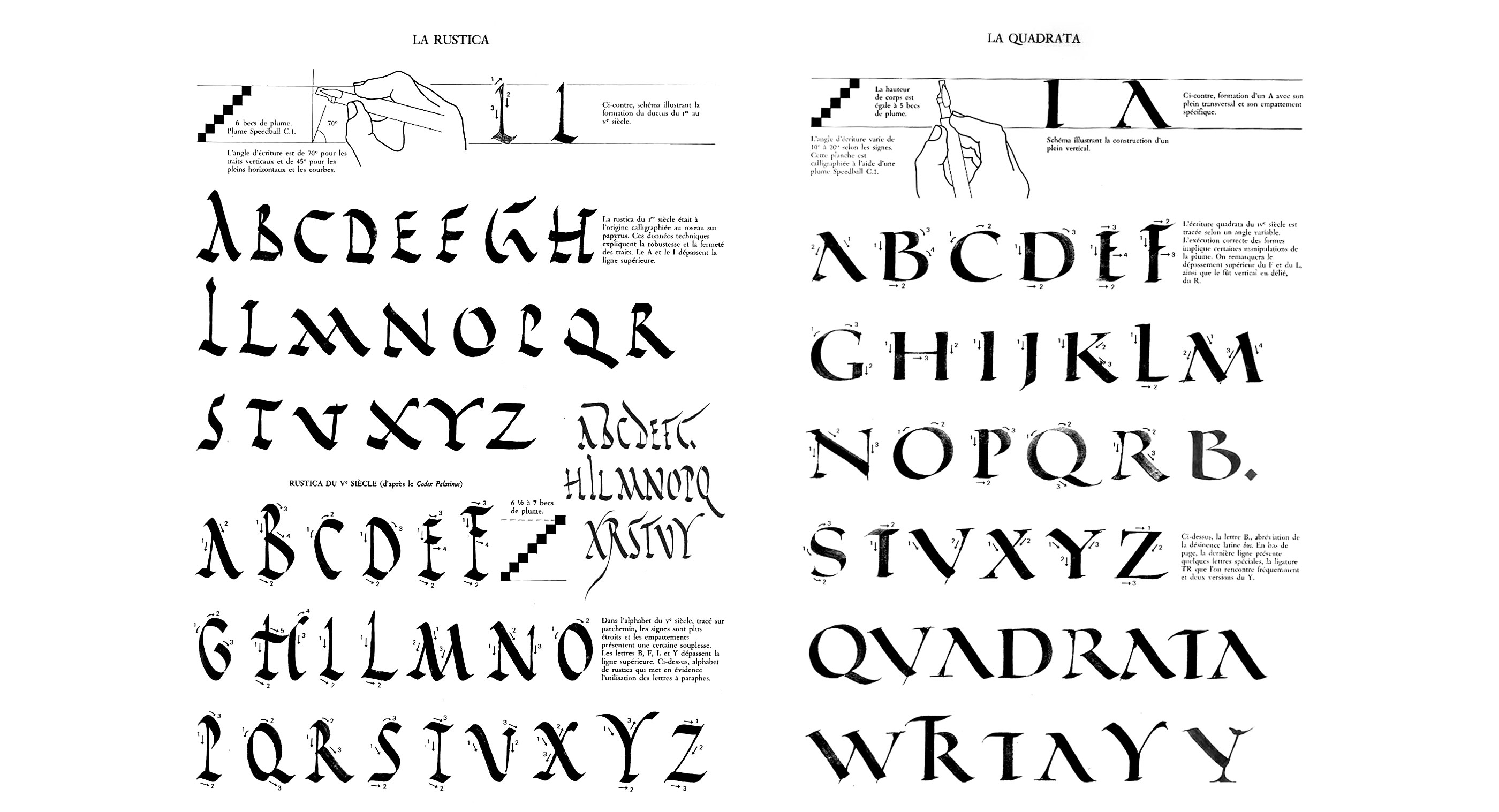
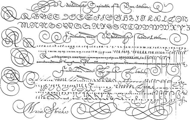 ^ Fondements.
 _______
notes : references and research :
Typography wiki pages : https://en.wikipedia.org/wiki/Category:Typography
___
Computer Font article :
Generic font families : sans-serif / serif / monospace / cursive / fantasy
figlet
woff (web open font format) / ttf (truetype) / otf (opentype) / svg (scalable vector graphic) / EOT (embedded opentype) / CWT (comptability web type)
@font-face
Pangram
Lorem Ipsum (placeholder text)
_______
notes : references and research :
Typography wiki pages : https://en.wikipedia.org/wiki/Category:Typography
___
Computer Font article :
Generic font families : sans-serif / serif / monospace / cursive / fantasy
figlet
woff (web open font format) / ttf (truetype) / otf (opentype) / svg (scalable vector graphic) / EOT (embedded opentype) / CWT (comptability web type)
@font-face
Pangram
Lorem Ipsum (placeholder text)